IBM x NAMI
In the summer of 2017, I was extremely fortunate to be 1 of 15 Maelstromers with IBM Design. Maelstrom is IBM Design’s internship for software designers, and it was one of the best experiences I’ve had.
The Need
NAMI was strategically thinking about getting grant funding to continue helping these students, but in order to do that, they needed to collect data from students somehow. They were participating in the actual sessions, but not so much in pre and post-surveys, leading NAMI with little data on how they were helping the students.
Project Information
- Users: Middle schoolers with mental illnesses
- Time: 2 weeks from kickoff to development completion
- Team: 3 PMs, 3 visual designers, 3 UX designers, 3 front-end developers, and 3 UX researchers.
- Involvement: generally end to end minus visual design, journey mapping and co-creation facilitation, primary role was front-end development
The Prototype
More information about the project
A human-centered approach
By focusing on giving the students a safe space to share their feelings, this could enable NAMI to collect better data anonomysly to show improvements in the students they were serving, which would lead to more grant funding, which would help them help more students, more.
Current constraints and problems
- The students participated in the sessions but not so much in the pre and post evaluations. The forms were clinical and difficult to understand. They also asked for the student’s name, which makes it awkward to genuinely fill out.
- NAMI was investing in tablets for the digital surveys they wanted us to create and it was likely that some of the middle schoolers would have phones. This constrained our solution to creating a mobile web app.
- The tablets might be passed around in case not everyone had a phone, and this meant the survey had to be quickly completed in under a minute.
- NAMI uses the feedback from the students to improve their programs and track performance of the students over time, but also uses it to show grant funders the impact they’re having on the students’ mental health.
The first iteration
We used design thinking methodologies such as need statements, empathy mapping, and storyboarding, to get a beter understanding of the students' needs.
We broke up into groups and came up with our own ideas and then used dot voting to help grab the best from each, and that was the direction for our first iteration.
Testing
At the end of the first week, NAMI was able to bring in some middle schoolers so we could validate some of our ideas and assumptions. We were able to see how the middle schoolers interacted with certain elements on the “screen”, such as what they would do if they saw a screen of emojis.
Takeaways:
- The students knew the language in the surveys was a bad attempt at relating to them. In fact one student said it seemed almost patronizing.
- Building trust through language was one of the most important things we needed to consider.
Actions we took using previous and new insights:
- To build trust, all the text was lowercase with no periods since that’s the style used in the social digital world.
- We made the survey anonymous. This makes the survey a safe space while still letting NAMI track overall student well-being over time and using this data for grant funding and improving the program.
- Incorporate copy that shows the students the survey is there to benefit them and help NAMI serve them better.
- Use “I just got here” and “I’m about to leave” to indicate which survey to take (my idea)
Developing the Survey in the Second Week
My primary discipline was front-end dev with Sam and Eric (who are brilliant), so here's an approximate outline of what we did to build the survey:
Week 1:
- Clarifying any technical questions
- Familiarizing ourselves with each other’s areas of technical strengths and weaknesses, and choosing the technology stack we wanted to build the survey with. We bootstrapped off of Create React App, React, Redux, and Sass.
- Defining the architecture of the application and data structure
- Brainstorming the best way to send data from the survey to the NAMI admins. We decided to send the data to Google Spreadsheets since they are familiar with it.
- Creating the skeleton for the codebase
- Working with the team on the design process
- Working with product managers to prioritize features and ideas using a prioritization grid to balance technical feasibility and value.
Week 2:
- Working with UX and Visual Design on the high fidelity mockups to assess technical feasibility, clarify edge cases, and understand different states of the interface
- Building the survey and it’s functionality
- Working on adding in the visual details as they became available from the Visual Designers
I just want to give a huge shout out to Sam and Eric for teaching me a bunch of things along the way!
Here’s What We Delivered!
- The web app that has both the pre and post surveys
- A roadmap outlining how this survey could evolve in the future
Here’s a prototype using the screenshots:
Rationale of certain pages:
- The landing page has the option to take the survey in English or Spanish to account for the student demographic.
- The welcome screen explains the benefits of sharing and provides the entry points into the pre or post survey. It also emphasizes anonymity and explains clearly what that is so the students have that safe space.
- The return home button on the thank you screen is there because the survey could be taken by multiple students sharing the same device. On this screen there is no option to go back since that might compromise the privacy of the student who just took the survey.
General decisions across the survey:
- The next buttons were on the bottom of the screen for easy access, which provides a better experience as well as results in faster submission times.
- The progress indicators (small dots) were there to show where in the survey the students are.
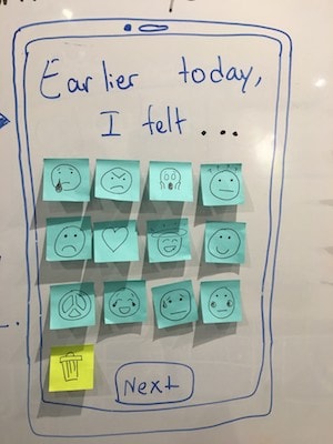
- The sentences on the survey questions are mostly complete. This helps bridge the gap between the students and analyzing their emotions because all they have to do is click an emoji or a thumbs up/down. The emojis were created by Mitchell.
The questions:
- They were designed by the Design Researchers, who created relatable questions that also provided NAMI data points with how the students felt over time and after each session. There are additional questions asked on the post-survey which help gauge the effect of the session.
In the first two weeks of Maelstrom, the 15 of us who had never met, designed, developed, and shipped something together.
My Growth & Contributions
That was a lot of stuff that happened in two weeks, and it was one of the hardest, yet most rewarding two weeks I've had. I was able to learn more about the design process, Design Thinking, Front-End Development, and storytelling. It was exciting learning about these areas and then directly applying them in a real-life project and shipping something in such a short period of time.
My contributions:
- Working with the team to understand the problem and come up with questions for stakeholders
- Doing design thinking exercises with the team such as storyboarding and needs statements to better understand the middle schoolers and their needs, frustrations, and scenarios.
- Working in a small group (we all split up into small groups) to wireframe the survey, and combining insights and ideas with the team.
- Coming up with the language for the entry point of the surveys. They are labelled as “I just got here” and “I’m about to leave” to be more relatable to the students.
- Working with my fellow front-end developers (FEDs) to decide on what technologies to use, how to architect the application, how to structure the data, and managing version control
- Working on developing the survey interface (including perfecting the breathing animation with Mitchell) in React, Redux, and Sass. Used Redux for the first time.
- Working with the product managers and other FEDs to determine priority and technical feasibility of features using a prioritization grid
- Working with UX and Visual Designers to assess technical feasibility of designs and to understand different interface states and edge cases.
- Contributing ideas for the roadmap of the survey
- Wrote the technical handoff guide so that the non-technical stakeholders could understand how the survey works, where the results go and how to access them, and implications of the internet being down when the survey is being filled out.
This was an amazing two weeks, and it was awesome working with all the Maelstromers to come up with something that can really impact these middle schoolers’ lives. Thank you IBM Design and NAMI!