AMCC Branding and Web Design
AMCC is an organization that shows how the American Muslim demographic is a huge part of the American economy. They host an annual conference that brings entrepreneurs and leaders together, and they also have a Shark Tank style showcase for startups.
Project Scope
My friend Bilal, and subsequently myself, were invited to: create the conference brand based on the theme client gave us, design and develop the website, and have a way for the client to make minor updates to the website.
Business Decisions & Client Interaction
There are a few ways to go when making a site: Code it from scratch, use a template, or use a CMS like Wordpress. We decided to use a bootstrap template combined with a drag and drop CMS because that allowed us to have a skeleton for the site while allowing us to heavily customize it. We also worked with the client to find a price that would be agreeable based on the work we provided and the template option fit that need.
Establishing clear expectations and guidelines is extremely important when working with a client because we want to:
- Maintain good relationships
- Meet deadlines
- Reduce friction
- Deliver quality work
Bilal set up a contract that clarified details of this agreement such as deadlines, how purchasing assets would be handled, as well as payment. We communicated with the client throughout the course of this project so that both us and the client were comfortable with where the website was headed.
Ideation & Branding
The branding for this project was really interesting and perhaps my favorite part of this project. The theme of the conference was “The Emerging Paradigm: Faith, Values, and Innovation.” As such, we wanted to juxtapose the historic Islamic art and architecture with the modern evolution of the American Muslim identity.
To start off, we looked at other cool conference websites to get an idea of how they are done, ways for us to make our site unique, as well as gain insight into how conferences are branded. I did a word brainstorming session where I listed out words and phrases that came to my head as I thought about what this brand could be. After that, I came up with a statement that put everything together: "Changing and shaping the economy to include Islamic perspectives and allow a greater catering to the Muslim market, all while preserving and displaying the Muslim identity and character."
Characteristics to keep in mind as we designed the brand:
- “bold”
- “unified”
- “Islamic"
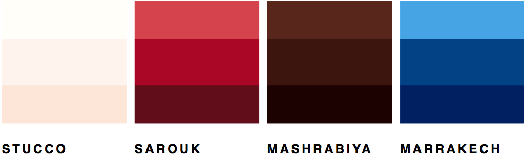
We drew inspiration for colors from:
- The classic red carpets in mosques
- The beige and brown of the exteriors of mosques and the mashrabiya
- The blue that is prevalent in Morocco
The combination of colors combined the traditional with the contemporary because it presented basic elements from Islamic architecture as a clean color palette.
For the fonts, we decided to go with Futura and Brandon Grotesque because they paired well together and contrasted each other in terms of the modern look versus the traditional, characteristic feel.
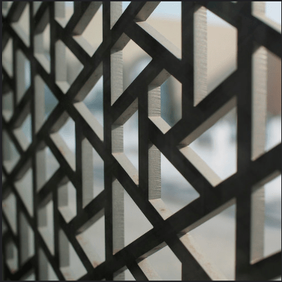
For the recurring pattern, we found a pattern used on a gate/wall that had that modern yet distinctly traditional style. It worked with the brand because of its Islamic geometry, as well as the modernity from the pattern’s hollowness and simplicity. We recreated it in Sketch and used it on the website.
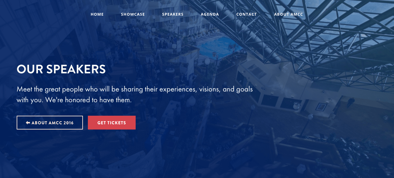
Web Design
We gathered the requirements from the client on what content the site should have such as the schedule, list of speakers, testimonials, as well as necessary assets and copy.
The information architecture:
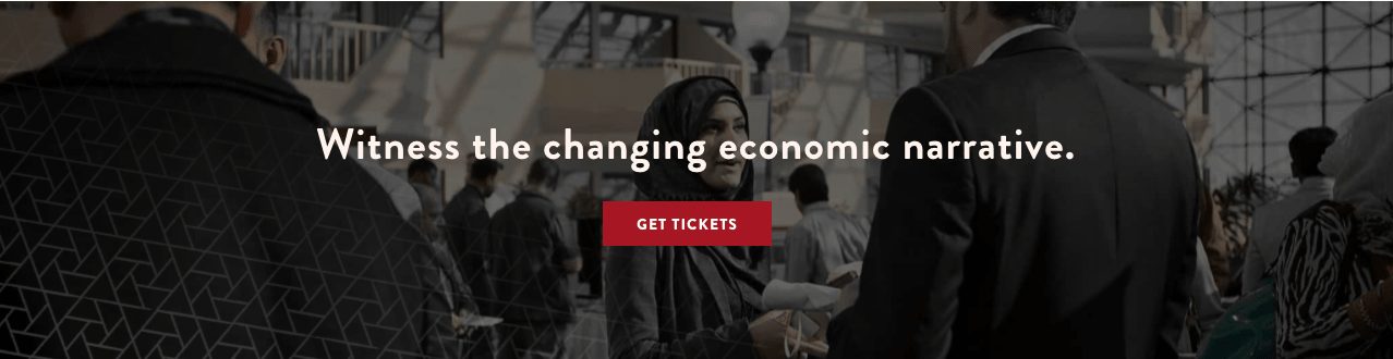
- A landing page for the main details with entry points into sub-pages for things like speaker bios and showcase rules
- Multiple CTAs for getting tickets on the landing page
- Persistent navigation menu across all pages for easy access to any part of the site
Guidelines for typography and color:
- CTA buttons were our primary color which was red
- Headers were in Brandon Grotesque to grab attention
- Page headers had a blue image background.
We also wrote some copy and selected imagery to use based on photos we were given. In addition, we ensured that responsive design was part of our process.
Web Development
We used HTML, SCSS (Bourbon), and our bootstrap template to develop the website, and integrated it with the drag and drop CMS. As version control is also very important, we used Bitbucket since they provide free private repos. The template gave us a starting point and really allowed us to focus on showcasing the conference brand.
Lessons Learned
This was a project where I had a lot of firsts such as figuring out the strategy on what services to provide the client based on what they need, working with client feedback, and doing a branding deep dive. We read about these things online, but it was neat to actually jump in and experience them. This was one of my favorite projects because I learned a lot, and because we were able to take something somewhat abstract and turn it into a brand and website.